
In its deliberate pursuit of the pure and the ordinary, MUJI achieves the extraordinary.
MUJI literally means “No Brand” in Japanese. MUJI is not a brand whose value rests in the frills and extras it adds to its products. Yet the the challenge here was to create an interactive campaign that announced MUJI’s international presence while staying true to MUJI’s philosophy of “simplicity achieved through a complexity of thought and design.”

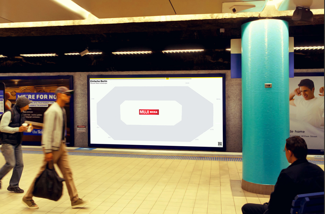
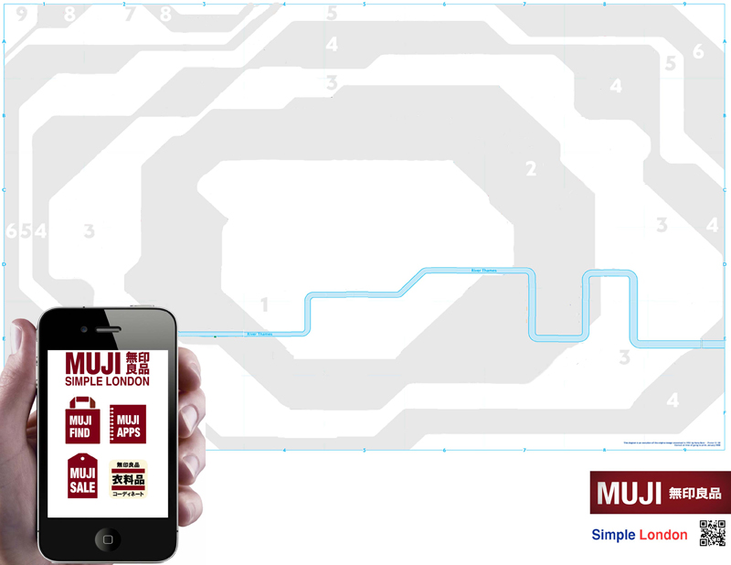
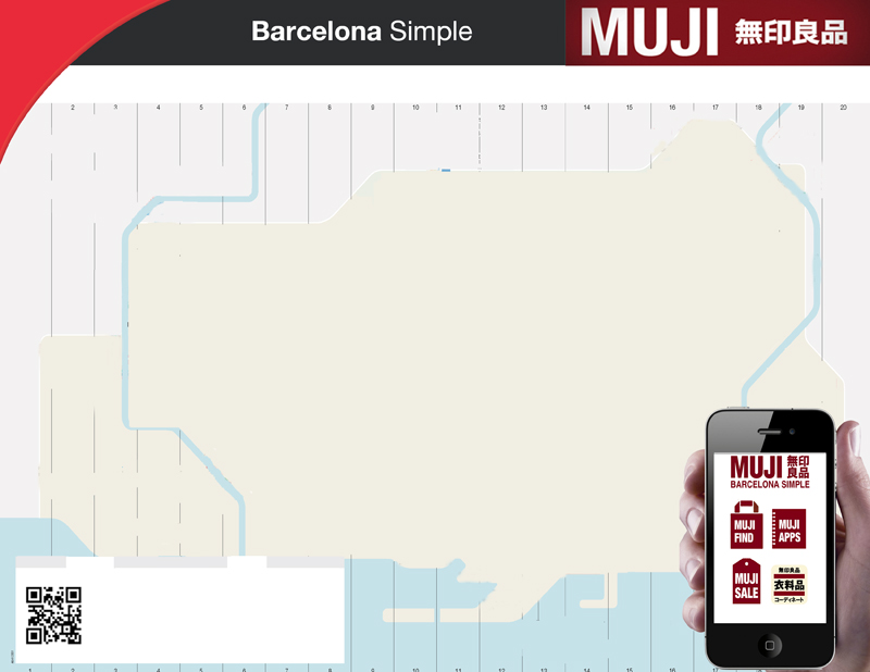
This MUJI "Simple City" subway map campaign is more than just a symbolic elimination and subtraction of the gratuitous features and designs MUJI likes to avoid. They also tell you how to find the nearest MUJI.
After everything else is stripped away, what is left over is a MUJI ad that both physically and interactively introduces the brand to a new city and gives anyone interested the simplest way of getting there. Distractions not included.
The campaign also called for some straight up product ads. We decided to contrast MUJI products simply with elements of nature that they somehow evoke or represent. The one you see is one of the one’s I came up with and is my favorite. So that’s why I decided to show it here.
